Whatsapp Poll Feature
On Mar 14, 2021, I challenged myself to design a Poll feature inside Whatsapp, which didn't exist then. I didn’t really have the privilege to spend more than three days on it since I’m also working full-time. I wanted to design this feature to primarily increase the value of the app for business usage, but it should, at the same time, also cater for the needs of private users.
I really got excited after Whatsapp implemented the Poll feature in November 2022 and really wanted to share this case study with you.
Personas
Liam Xavier (Primary persona)
40 years, business partner
User group
Business partners & colleagues
Goals
- Wants to quickly plan new events or meetings.
- Needs to align on places and times.
Frustration
- Trouble to find all the new functionalities in the app.
Personality
- Goal-oriented in his communication.
- Purposeful and intentional.
- Willing to put in the hard work and time to reach the next level, but he needs to see the path.
Emily Jones (Secondary persona)
23 years, marketing student
User group
Younger people with private contact
Goals
- Wants to decide on questions, e.g. which birthday present to buy, where to go, which things are cooler.
- Wants to find out what ideas the other group members have.
Motivations
- Entertainment is important for her.
- She’s in a lot of different group chats active at the same time and in general very active.
Problems
I assumed two problems that Liam and Emily are facing that can be solved with a Poll feature.
#1 PROBLEM
Liam is always in a rush, jumping from one meeting to another and feels hard to plan a meeting in a Whatsapp chat; thus, they are trying to use other apps/platforms to do the job. Therefore Whatsapp is losing lots of potential users.
#2 PROBLEM
Emily cannot easily plan events in Whatsapp group chats and feel very hard to keep track of peoples responses about an event with lots of people in those groups.
Direct & Indirect Competitor Analysis
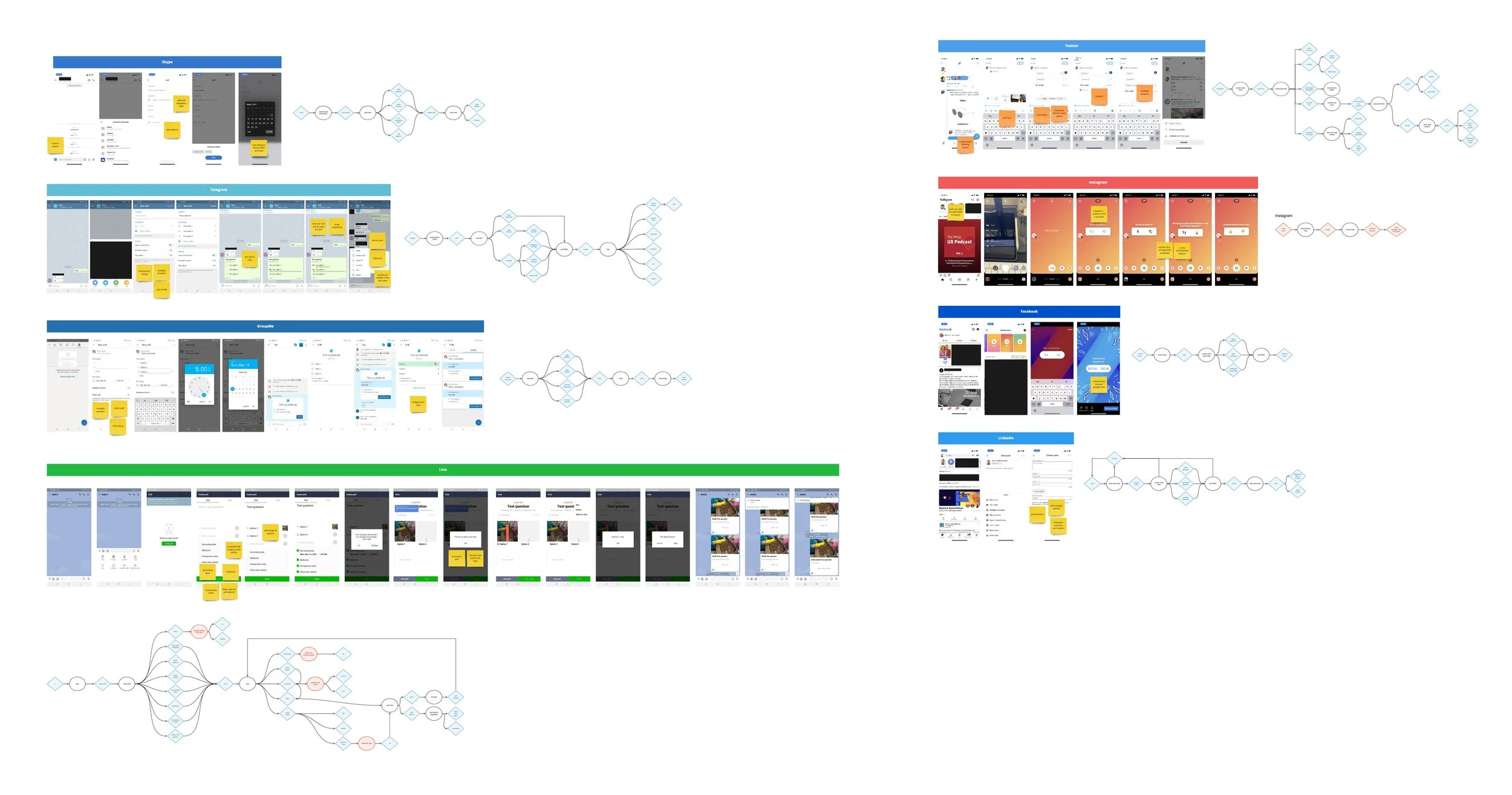
This competitor analysis helped me find discrepancies between different platforms, the primarily used micro-features, and compare the findings to our personas' goals and needs to drive my design decisions.
Very frequently used features
100% of the platforms are limiting the number of characters for the options
88% are limiting the number of characters for the question
75% are enabling the user to add multiple options
63% of those platforms have a poll length/duration/expiration period for the poll
Occasionally used
38% allow the user to pin the poll to his/her profile or chat AND stop the poll.
25% allow anonymous voting and undo/retract vote after submission.
Very rarely used
13% of those platforms offer the following features (add location, options template, custom effects, quiz mode, undo unpinning, reorder options, add image to options, and allow other users to add options to a poll).
By looking at those numbers mentioned in the likert scale for how frequently those features are used, and by comparing them to Liam's and Emily's goals, needs, and motivations, I decided to keep the very frequently used features as well as mixing some other features that were occasionally or very rarely used like pin poll to chat, stop poll, location, options template, reorder options.
Each platform is integrating the poll function in a way that work with their business needs and hopefully based on what their customers need, even though I uncovered some critical issues that I'll mention below.
Telegram enables all users in a group chat to unpin a poll from the chat and this affects the whole group and not only themselves.
People rarely use a poll to receive answers for only one option. Telegram also adds only one option as soon as you start creating your poll then the user needs to tap another button to create the 2nd option which is necessary most of the times and this behavior adds to the user's cognitive load which he doesn't need.
GroupMe also asks the user to tap the "Vote" button to start voting whereas most of the other platforms enable the user to directly vote in the chat without any further steps.
Line enables anyone in a group to add new options to a submitted poll which could create confusion and especially after the user votes and suddenly he sees new options added or he might not notice it anyway.
Problems gathered from user flows
HMWs
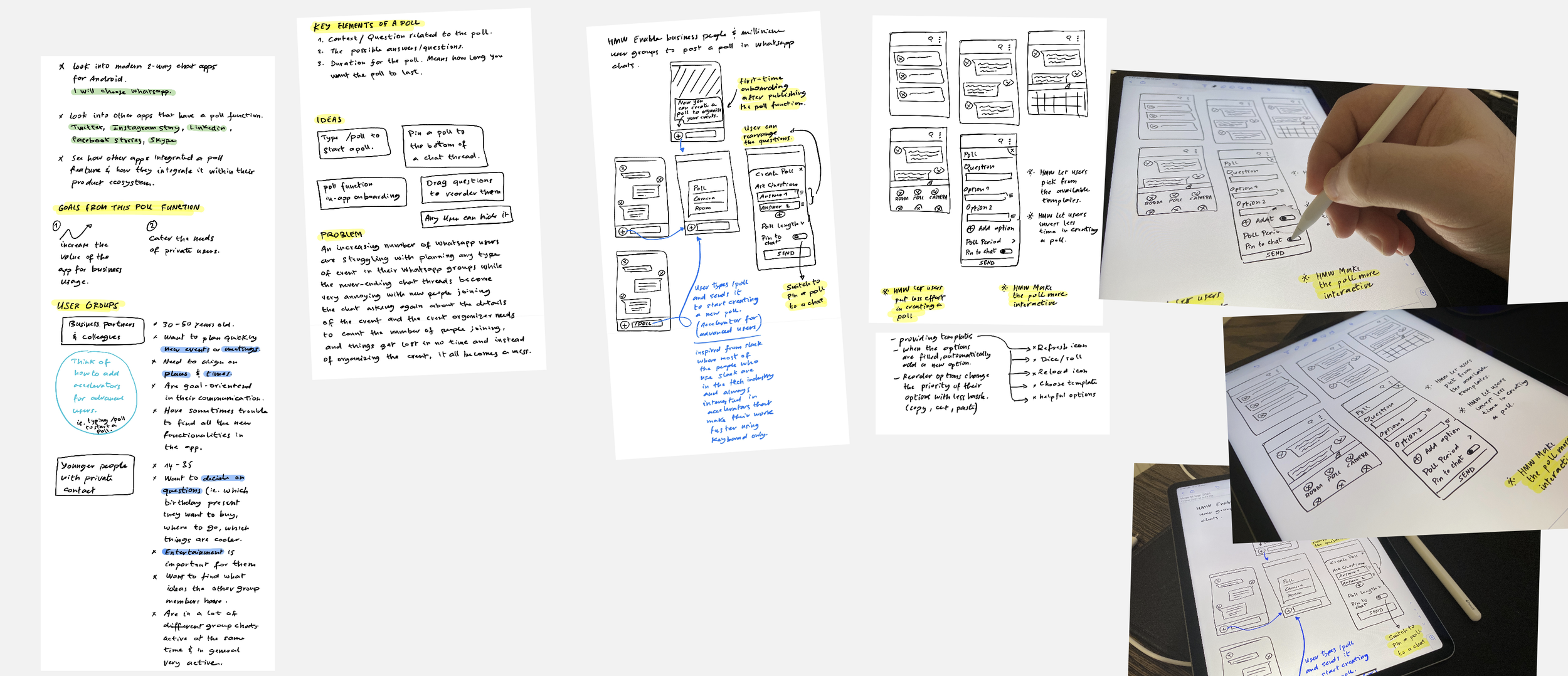
After all the insights gathered from the competitor analysis, user flows as well as comparing all the features to what Liam and Emily want / need and their motivations, I used the HMW (How Might We) technique to start generating ideas.
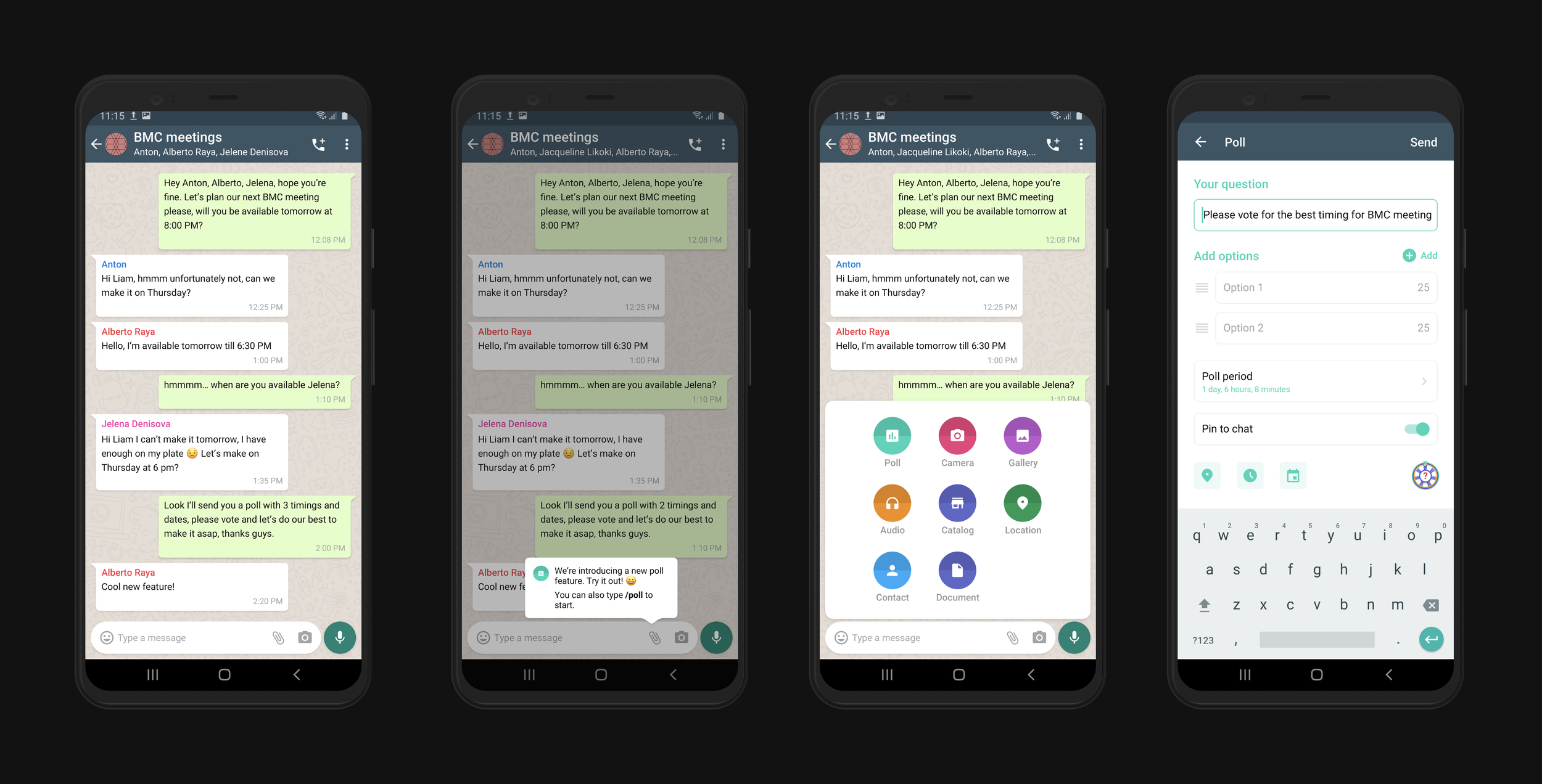
Type /poll in the message input to start creating a poll - as an accelerator for advanced users.
💡 Usability Heuristic #7 Shortcuts — hidden from novice users — may speed up the interaction for the expert user such that the design cater to both inexperienced and experienced users. Allow users to tailor frequent actions.
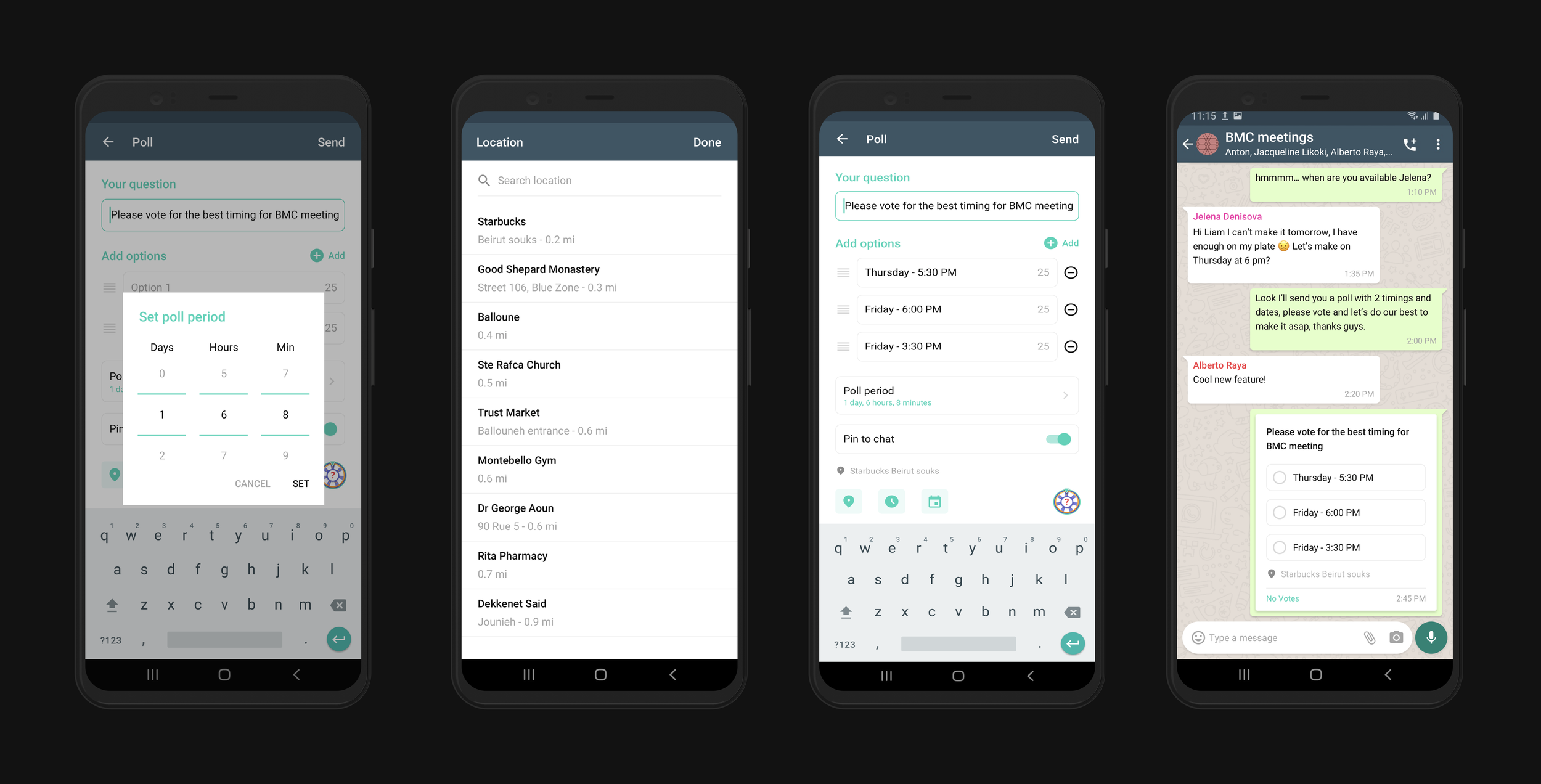
Reorder options when creating a poll to make it easier on the user if he wants to swap options/answers instead of cutting/copying and pasting.
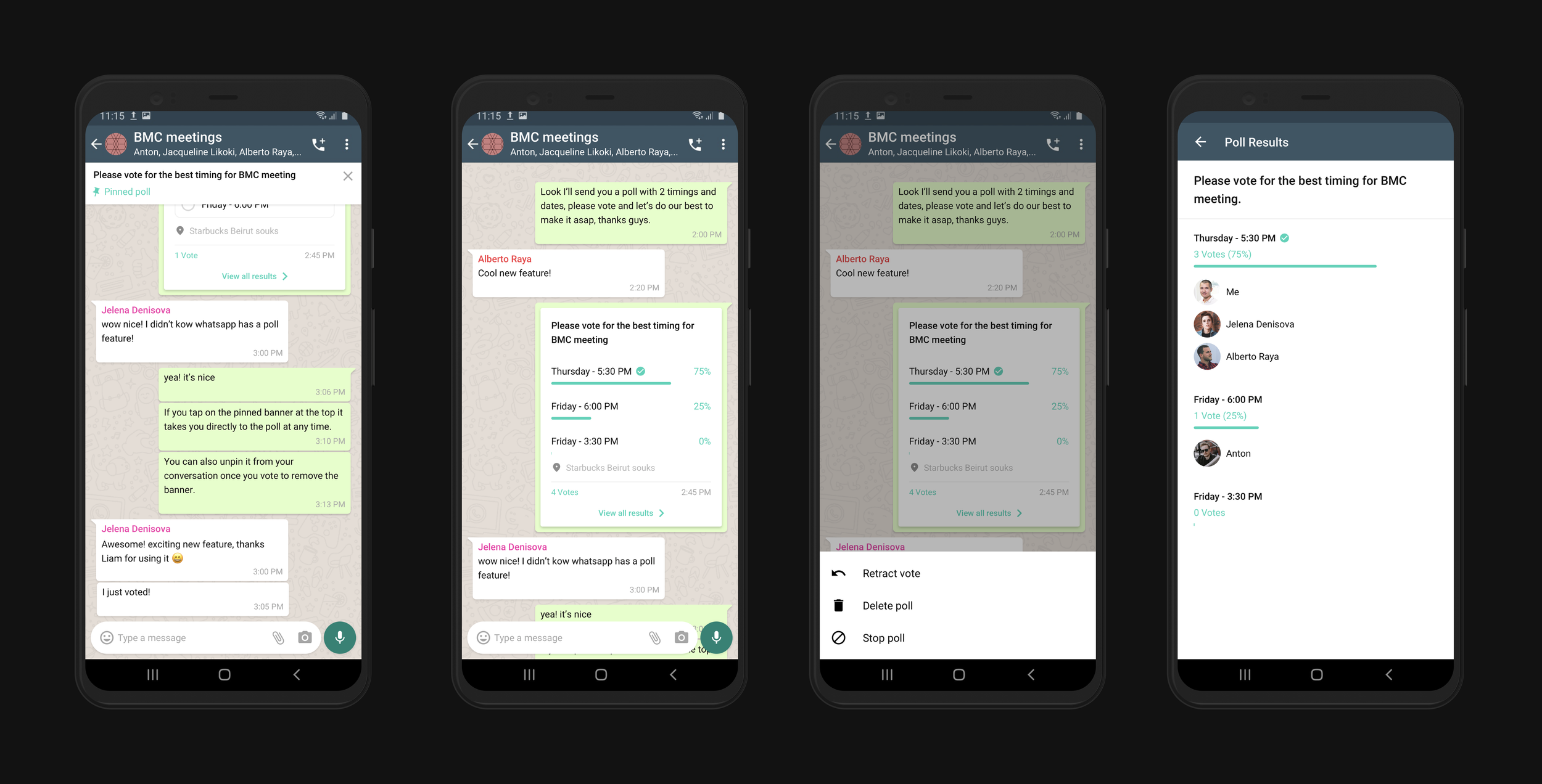
Pin the poll to the chat to get back to it at anytime while it's running.
Users can only unpin a poll from a chat for themselves.
Wheel of fortune — Roll the wheel to get ideas on what to ask your friends and increase engagement.
UI Deliverables
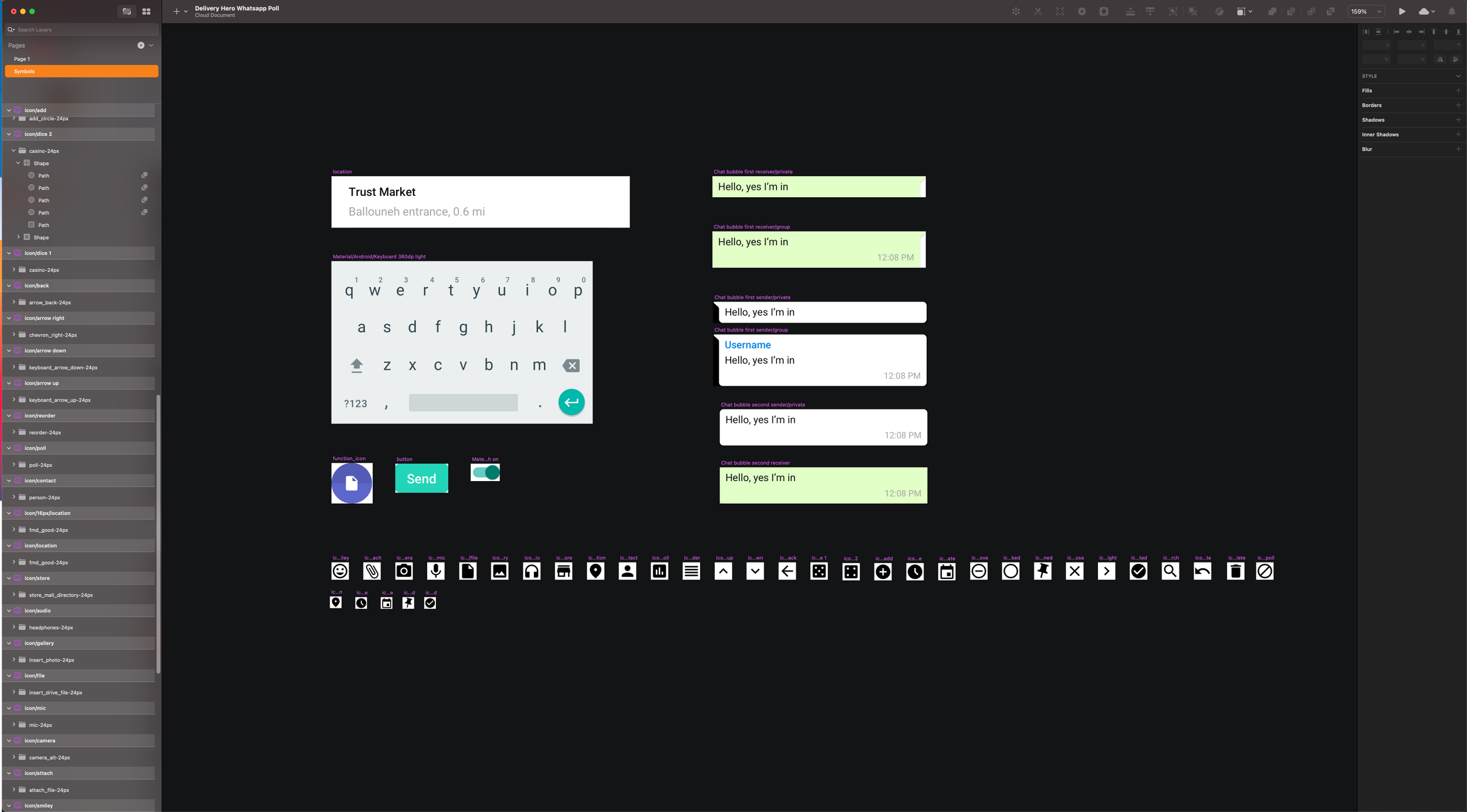
After figuring out all the needed features, I jumped into Sketch to quickly create the needed components mimicing Whatsapp real user interface, finalize the UI and create a high-fidelity prototype.
Interactive Prototype
Ordered tasks
✏️ Type /poll to start a new poll or tap on the 📎 and choose "Poll".
✏️ Type your question and the options 1, 2.
🔃 Reorder Options 1, 2.
🔮 Try the wheel of fortune.
✅ Send the poll to the chat.
✔️ Scroll to the poll and submit your vote for Thursday.
😀 You're Done!
