Smashi
For the Driven, The Dreamers, The Doers
The Smashi team came to me in 2020 with a website and a mobile app that already existed on the market. You can find below some screenshots of what the website looked like.
The challenge
Enhance the user engagement
Increase Conversion rate
Increase the retention rate.
Redesign the whole web user interface, as well as a new Android TV app and without question maintaining the brand consistency across all platforms.
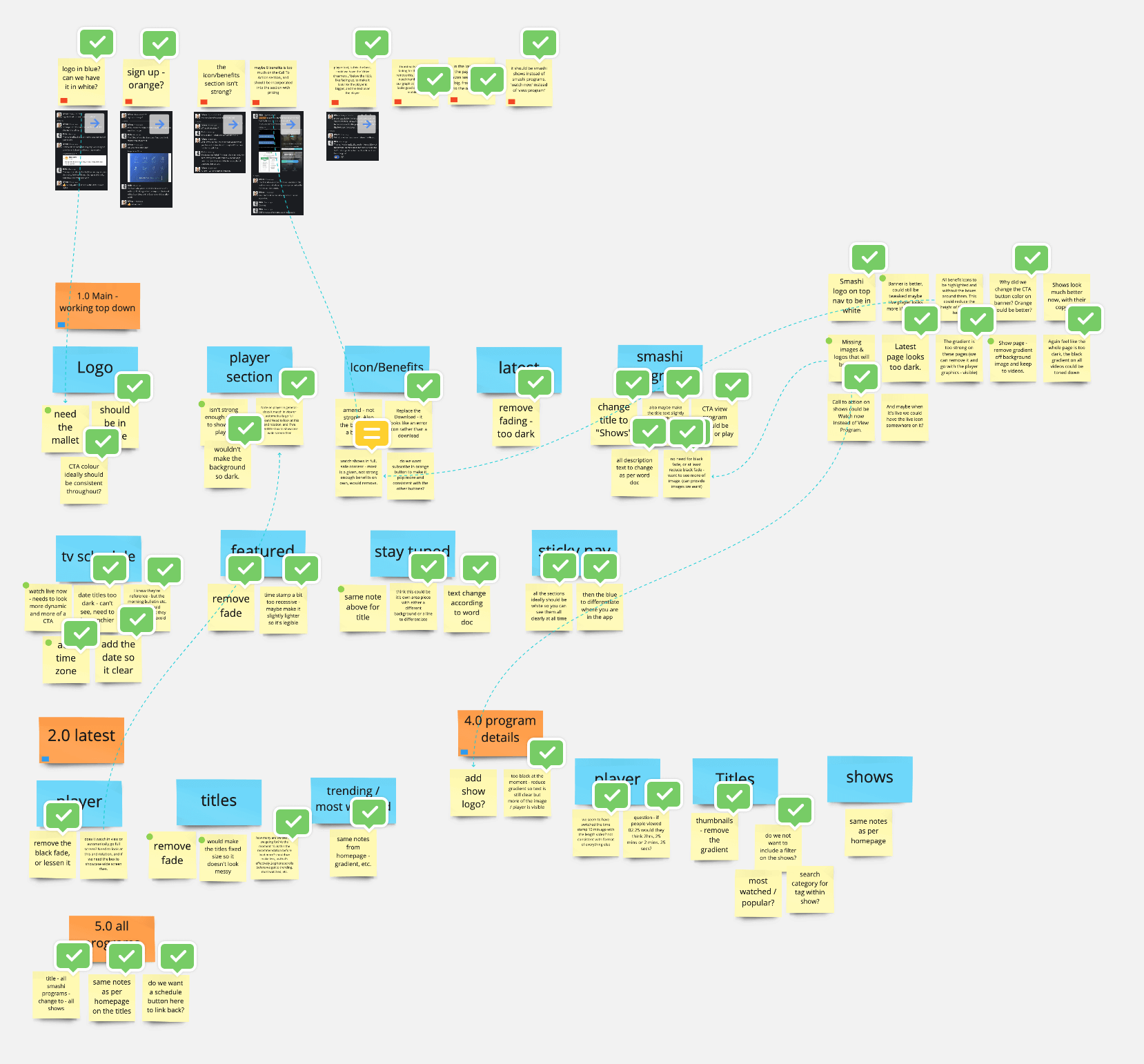
I started looking at the previous website and mobile app, listening to the Smashi team wants, needs, and current problems, asking them questions during several zoom calls, and jotting what’s working, what’s not working and what they wish, want, and hope for the new website and mobile app to do.
What’s working, What’s not working, What do you wish/want/hope for your website/app to do - Project timeline
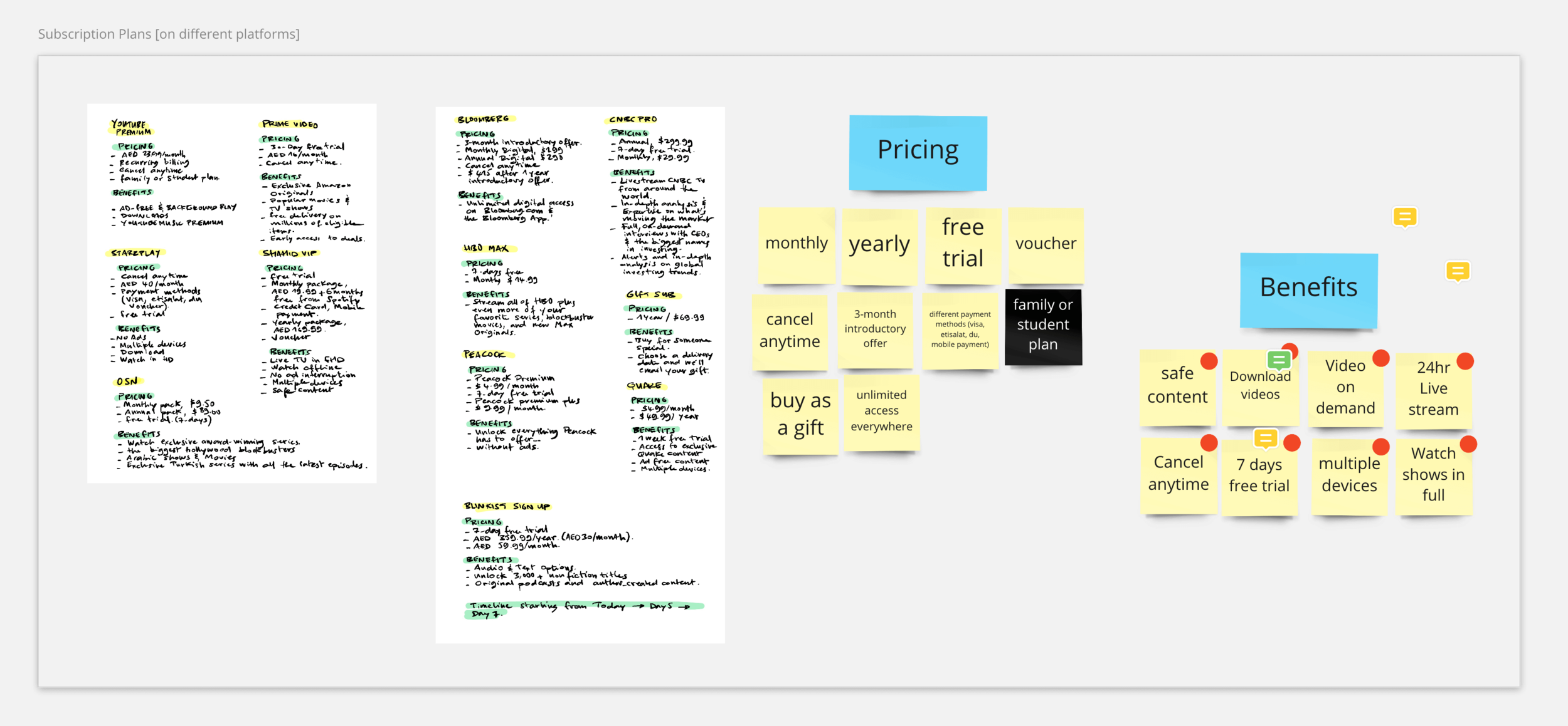
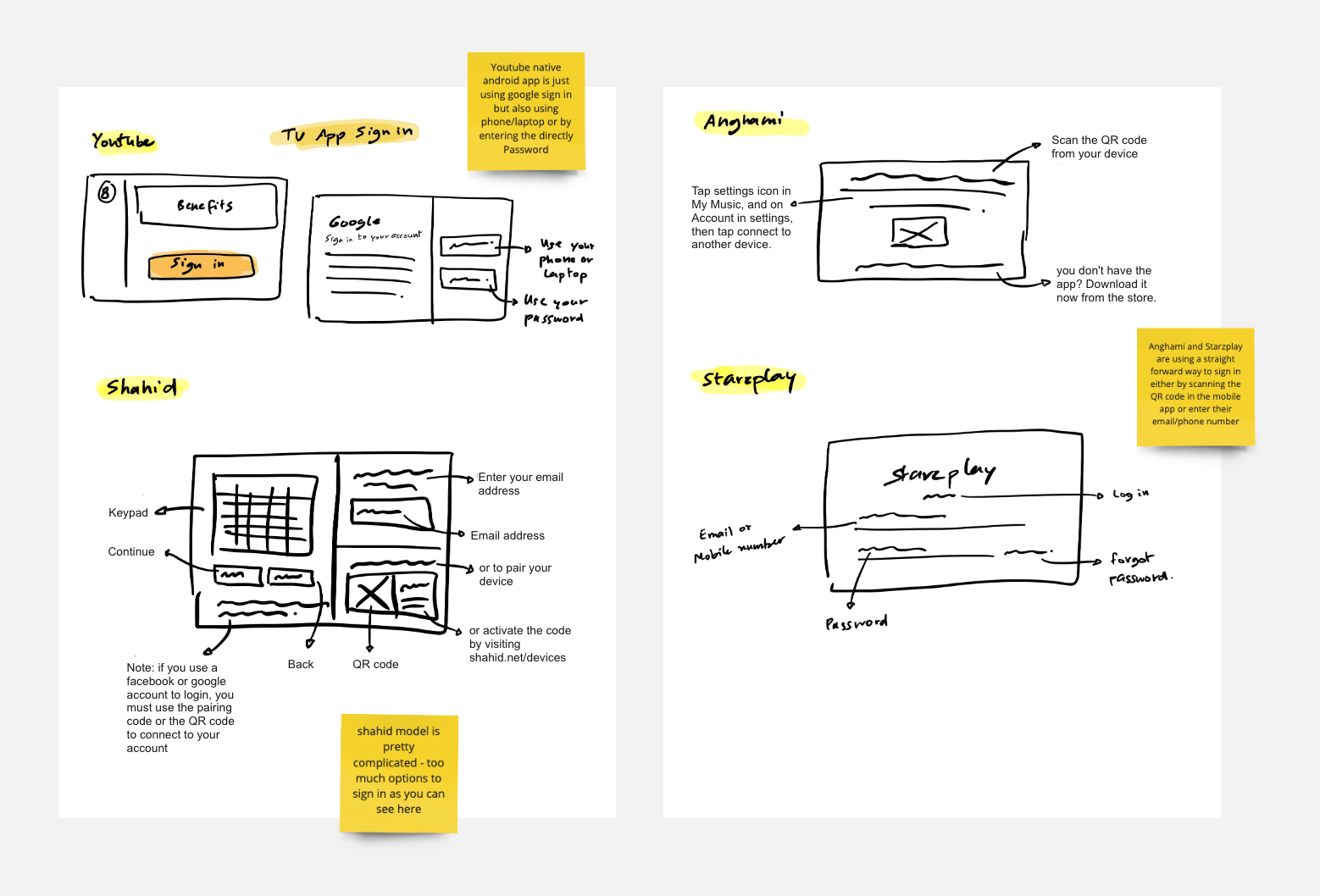
Then we went into the process of comparing ideas from other business streaming platforms with great user retention and user engagement.
Having made the competitor analysis helped us create a new information architecture for Smashi web platform.
What’s working, What’s not working, What do you wish/want/hope for your website/app to do - Project timeline
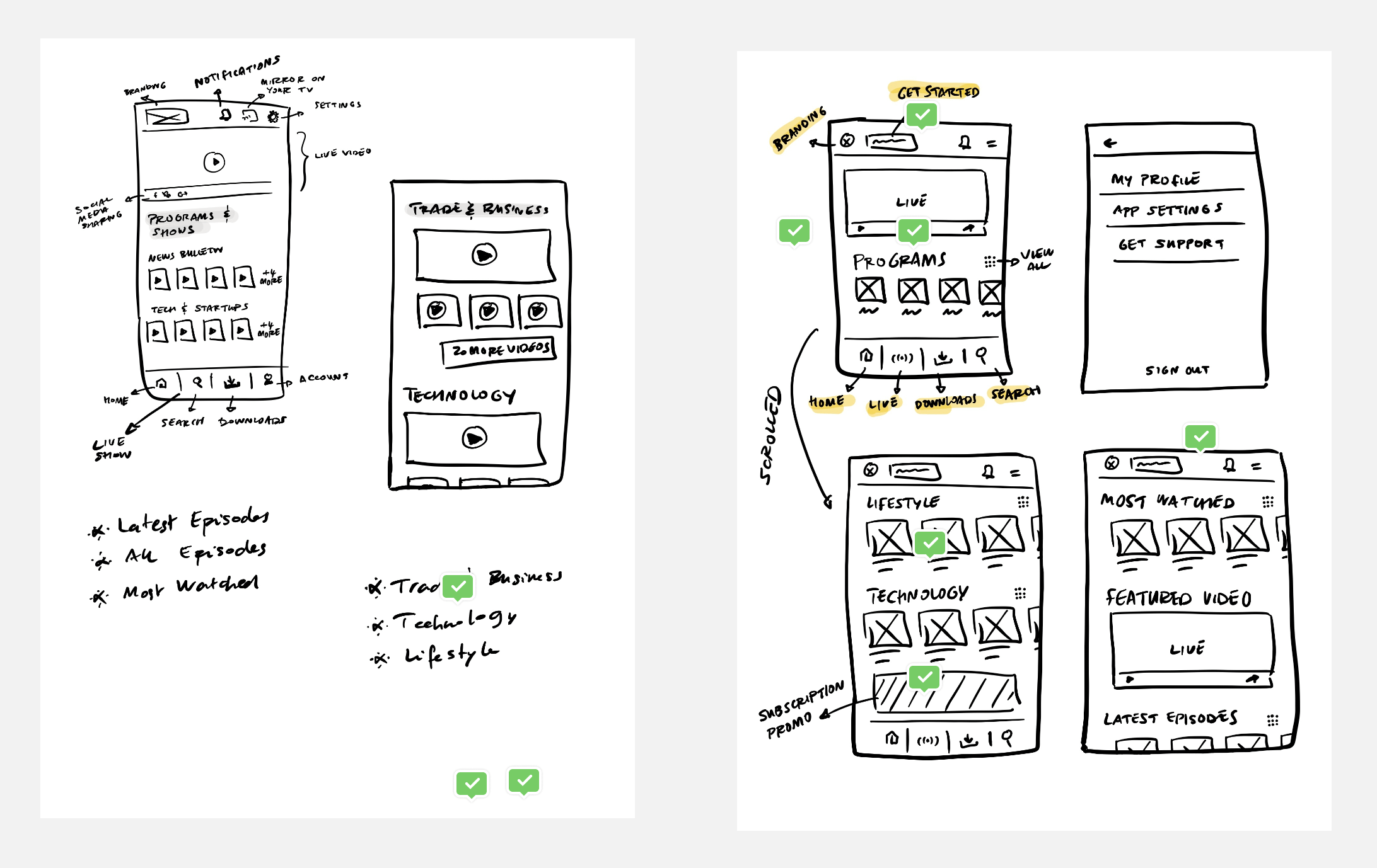
We quickly transitioned into brainstorming and sketching our own concepts. I drafted some initial sketches, blending existing ideas, and then reviewed them with the Smashi team. Together, we evaluated and chose the ideas we believed had the best potential to address our challenge.
After solidifying our primary concepts and identifying the ones we felt held the most promise, we assembled them into basic wireframes, detailing the content for each screen.
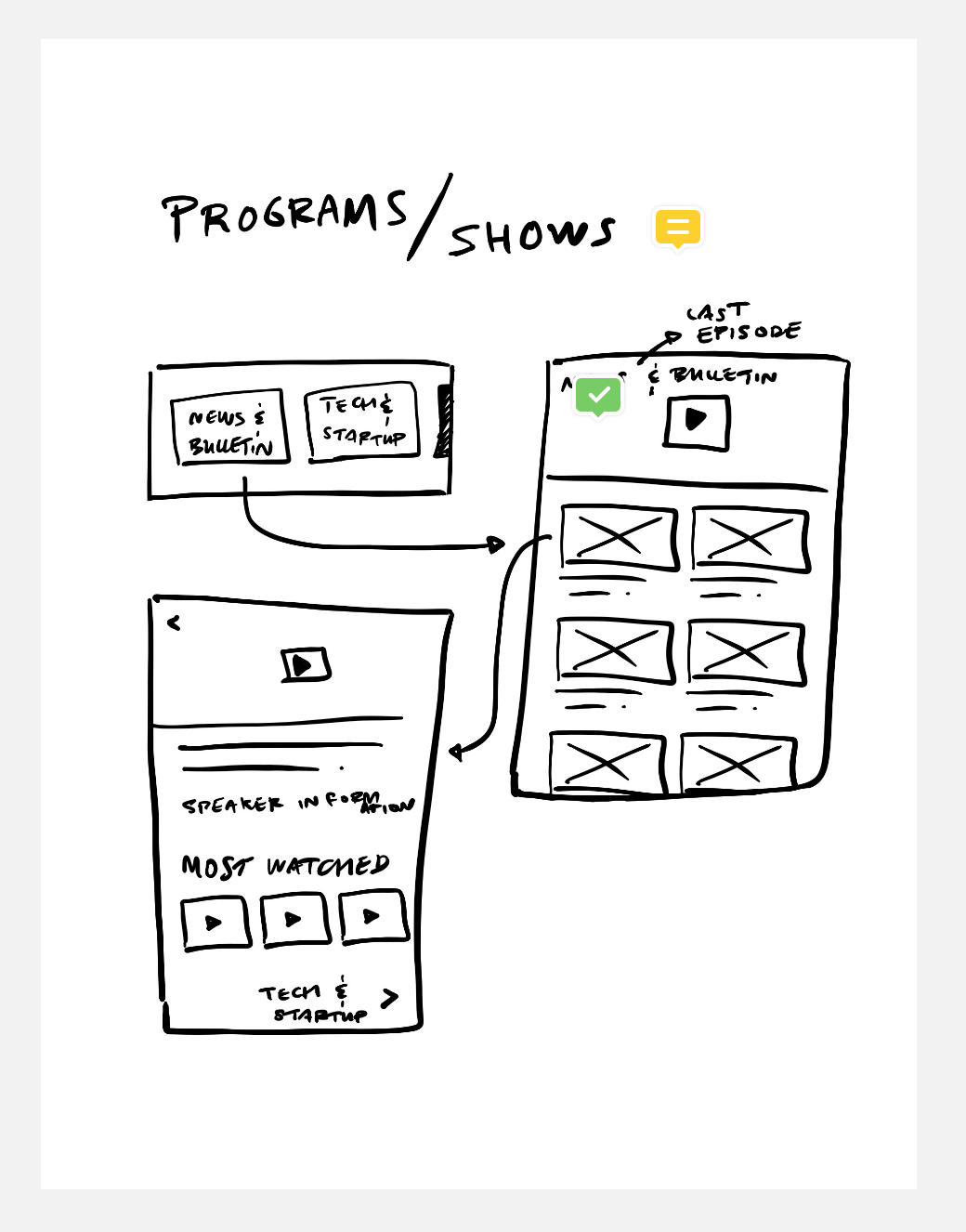
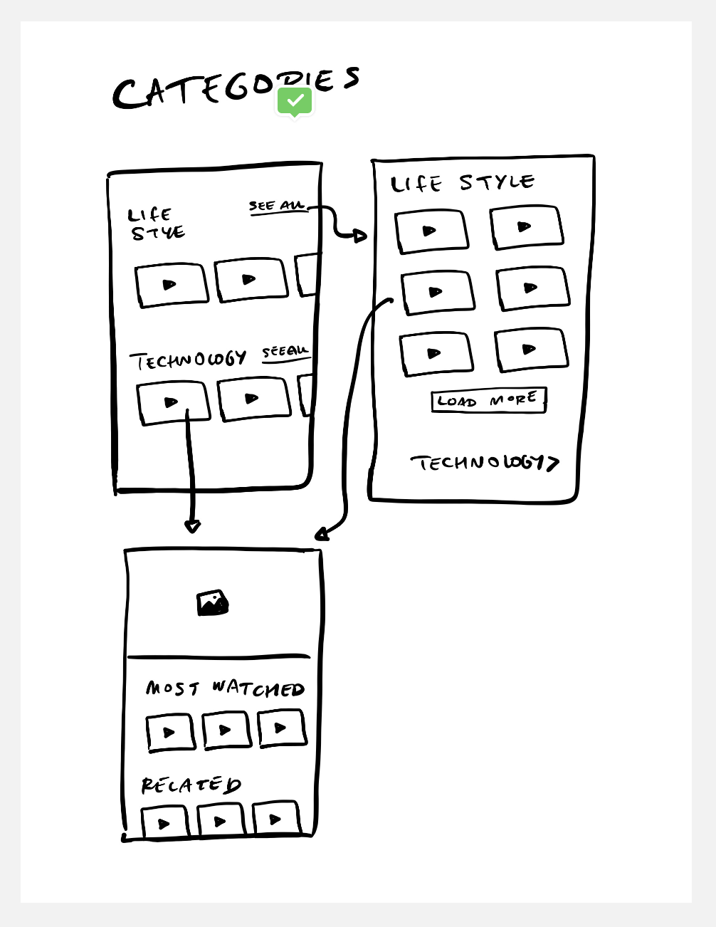
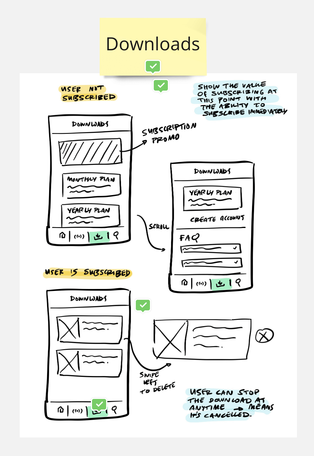
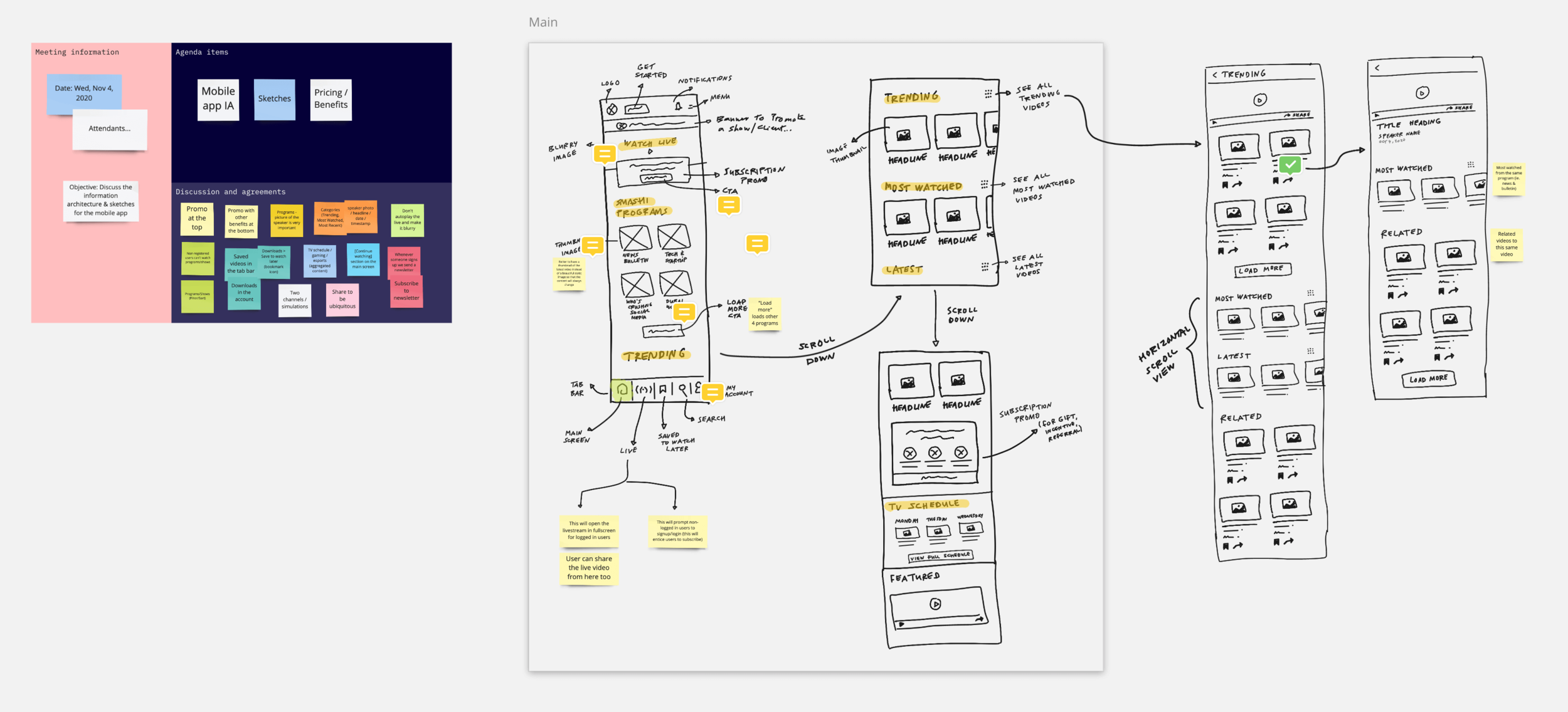
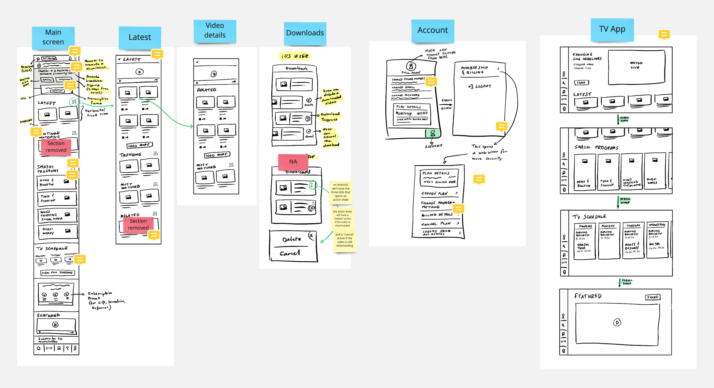
Then we started building a low-fidelity prototype with all the screens, sharing with the team and getting their feedback.
And after two months of hard work, I delivered detailed high-fidelity mockups that I handed over to the development team.


